Dyslexia can pose significant challenges when it comes to reading and comprehending text. However, dyslexia-friendly fonts are specifically designed to enhance readability for those with dyslexia. By understanding the science behind these fonts and implementing practical tips, dyslexic readers can experience improved reading experiences. This blog post explores the benefits, disadvantages, and recommendations for using dyslexia-friendly fonts, providing valuable insights for individuals with dyslexia and those supporting them.
Key Takeaways
- Dyslexia-friendly fonts are specifically designed to enhance readability for individuals with dyslexia.
- The science behind dyslexia-friendly fonts involves optimizing letter spacing, shape, and other typographic elements.
- When choosing fonts for dyslexic readers, consider factors such as letterform simplicity and clarity.
- Implementing dyslexia-friendly fonts can make a significant difference in the reading experience for individuals with dyslexia.
Feel free to share with your friends what you've discovered!
Understanding Dyslexia and Reading Challenges
Dyslexia is a learning disorder that affects a person's ability to read, write, and spell. It is a neurodevelopmental condition that occurs in about 5-10% of the population. Individuals with dyslexia often struggle with decoding words, recognizing letter sounds, and understanding the order of letters in words.
Reading challenges associated with dyslexia can be frustrating and can have a significant impact on a person's academic and professional success. However, there are strategies and interventions that can help individuals with dyslexia overcome these challenges and improve their reading skills.
One approach that has shown promise is the use of dyslexia-friendly fonts. These fonts are designed specifically to enhance readability for individuals with dyslexia. They incorporate features such as larger letter spacing, heavier baselines, and varied letter shapes to minimize confusion and improve letter recognition.
Research studies have explored the effectiveness of dyslexia-friendly fonts in improving reading speed and accuracy for individuals with dyslexia. The results have been promising, with many participants showing improvements in their reading abilities when reading text in dyslexia-friendly fonts compared to standard fonts.
Some popular dyslexia-friendly fonts include OpenDyslexic, Dyslexie, and Lexie Readable. These fonts can be used in various settings, including educational materials, websites, and e-books, to make reading more accessible for individuals with dyslexia.
It is important to note that dyslexia-friendly fonts are not a cure for dyslexia. They are just one tool among many that can assist individuals with dyslexia in overcoming reading challenges. Other interventions, such as structured literacy instruction and assistive technologies, may also be beneficial in improving reading skills for individuals with dyslexia.
Dyslexia is a learning disorder that presents challenges in reading and writing. dyslexia-friendly fonts have shown promise in enhancing readability for individuals with dyslexia. while they are not a cure, they can be a valuable tool in supporting individuals with dyslexia and improving their reading skills.
→ When to Test for Dyslexia: Best Age and Practices
The Science Behind Dyslexia-Friendly Fonts
Do you ever wonder why certain fonts are considered "dyslexia-friendly" and how they can enhance readability for individuals with dyslexia? Let's dive into the science behind dyslexia-friendly fonts and explore how they can make a difference.
When it comes to dyslexia, reading can be a challenging task due to difficulties in processing language. However, certain fonts have been designed with features that aim to alleviate these challenges and enhance readability for individuals with dyslexia.
One key aspect of dyslexia-friendly fonts is their emphasis on letter differentiation. Dyslexic readers often struggle with distinguishing between similar-looking letters, such as "b" and "d". Dyslexia-friendly fonts address this issue by modifying letterforms to make them more distinct. For example, they may alter the shape or orientation of certain letters to reduce confusion.
Another important factor is the spacing between letters and words. Dyslexia-friendly fonts typically feature increased letter and word spacing. This extra spacing helps prevent letters and words from blending together, making it easier for dyslexic readers to identify and process each individual element.
Dyslexia-friendly fonts often incorporate other design elements that enhance readability. these can include larger font sizes, increased line spacing, and thicker strokes. by optimizing these visual aspects, dyslexia-friendly fonts provide greater clarity and reduce the strain on the reader's eyes.
It's worth noting that while dyslexia-friendly fonts can be beneficial for individuals with dyslexia, they may not be universally effective. Dyslexia is a complex condition that varies from person to person, and what works for one individual may not work for another. It's important to consider individual needs and preferences when selecting fonts for dyslexic readers.
Dyslexia-friendly fonts are designed with specific features to enhance readability for individuals with dyslexia. by addressing issues such as letter differentiation and spacing, these fonts can make reading a more accessible and enjoyable experience for dyslexic readers.
💡 Did you know that dyslexia-friendly fonts can significantly improve readability for those with dyslexia? These fonts incorporate specific design features to reduce letter confusion and improve letter spacing. Give them a try!
What is the science behind dyslexia-friendly fonts? Dyslexia-friendly fonts are designed with specific features, such as larger openings in letters like 'a' and 'e', heavier bottoms to prevent flipping, and increased spacing to reduce letter crowding. These modifications help individuals with dyslexia read more accurately and fluently.
How do dyslexia-friendly fonts enhance readability? Dyslexia-friendly fonts make reading easier for individuals with dyslexia by reducing the likelihood of letter confusion. The unique design elements in these fonts improve letter recognition and minimize the chances of reversing or flipping letters, resulting in improved reading comprehension.
→ Typography and Dyslexia: Is Times New Roman Friendly?
Choosing the Right Fonts for Dyslexic Readers
When it comes to enhancing readability for individuals with dyslexia, choosing the right fonts can make a significant difference. Dyslexia-friendly fonts are specifically designed to minimize the reading challenges faced by dyslexic readers, such as letter confusion and word spacing issues. These fonts aim to improve reading accuracy, fluency, and overall comprehension. Let's delve into some key considerations for selecting the most suitable fonts for dyslexic readers.
Typeface Characteristics
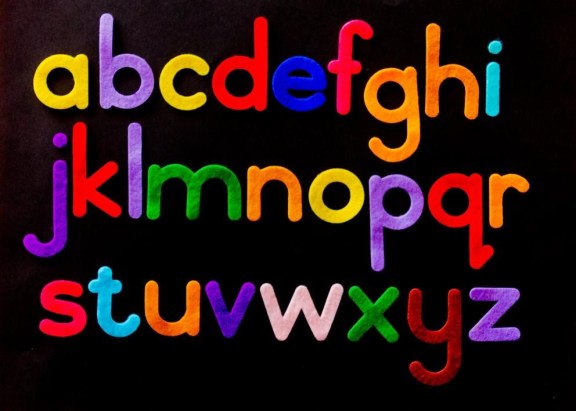
Fonts that are easily readable for dyslexic individuals typically possess specific characteristics. First and foremost, sans-serif fonts are often recommended due to their simplicity and clarity. These fonts lack the small lines at the ends of characters (serifs), which can cause confusion for dyslexic readers.
Fonts with larger letter spacing, slightly increased letter height, and distinct letter shapes are preferred. these features help to differentiate between individual letters and prevent them from blending together, improving overall legibility.
Dyslexia-Friendly Fonts
Several dyslexia-friendly fonts have been developed with the aim of enhancing readability for dyslexic readers. Some popular choices include:
- OpenDyslexic: Designed with weighted bottoms to prevent letters from flipping or rotating in the reader's mind.
- Dyslexie: Features unique letter shapes and heavier bases to minimize visual confusion.
- Lexie Readable: Utilizes increased spacing to enhance letter differentiation and readability.
Further Considerations
While dyslexia-friendly fonts can be beneficial, it's important to remember that individual preferences may vary. Some dyslexic readers may find certain fonts more readable than others, so it's crucial to consider personal preferences when selecting fonts. Experimenting with different options and gathering feedback from dyslexic readers can help determine the most effective font choice.
Choosing the right fonts plays a crucial role in enhancing readability for dyslexic readers. by considering key characteristics and exploring dyslexia-friendly font options, we can ensure that individuals with dyslexia have an improved reading experience.
→ Dyslexia and Anger: Managing Emotional Challenges in Education
Practical Tips for Implementing Dyslexia-Friendly Fonts
When it comes to enhancing readability for individuals with dyslexia, choosing the right font can make a world of difference. Dyslexia-friendly fonts are specifically designed to minimize confusion and improve reading efficiency for those with dyslexia.
- Choose a Typeface: Opt for fonts that have been specifically designed to be dyslexia-friendly, such as OpenDyslexic, Dyslexie, or Lexie Readable. These typefaces incorporate features like increased spacing between letters, heavier bottoms, and varied letter shapes to enhance readability.
- Consider Font Size: Adjust the font size to ensure optimal readability. While larger fonts may seem like the obvious choice, keep in mind that excessively large text can cause the words to blend together. Strike a balance by choosing a font size that is comfortable for reading but not overwhelming.
- Contrast is Key: Pay attention to the contrast between the font color and the background. Use high contrast combinations, such as black text on a white background or vice versa, to ensure legibility. Avoid low contrast combinations, like light gray text on a white background, as they can strain the eyes.
- Avoid Fancy Fonts: Steer clear of decorative or ornate fonts that may look visually appealing but can be challenging for individuals with dyslexia to decipher. Stick to simple and clean fonts that prioritize clarity and readability.
- Test and Gather Feedback: Before implementing dyslexia-friendly fonts, conduct trials and gather feedback from individuals with dyslexia. Their insights can provide valuable information on the effectiveness of the chosen fonts and any necessary adjustments.
By following these practical tips, you can create a more inclusive reading experience for individuals with dyslexia. Remember, the goal is to enhance readability and minimize any potential barriers to understanding. So, go ahead and choose the right dyslexia-friendly font to make reading a more enjoyable and accessible experience for everyone.
Benefits and Advantages of Dyslexia-Friendly Fonts
Dyslexia-friendly fonts have gained recognition for their ability to enhance readability and provide a more accessible reading experience for individuals with dyslexia. These fonts are specifically designed to address the challenges faced by people with dyslexia, such as letter confusion and difficulty in reading fluently.
- Improved readability: Dyslexia-friendly fonts incorporate design elements that make it easier for individuals with dyslexia to distinguish between similar letters and characters. These fonts utilize features like increased letter spacing, unique letter shapes, and heavier baselines, which reduce visual crowding and improve legibility.
- Enhanced comprehension: By reducing the cognitive load associated with reading, dyslexia-friendly fonts allow individuals with dyslexia to focus more on understanding the content. This can lead to improved comprehension and retention of information, making learning a more enjoyable and effective experience.
- Increased reading speed: Dyslexia-friendly fonts can help individuals with dyslexia read more quickly and efficiently. The unique design features of these fonts aid in reducing reading errors and promoting a smoother reading flow, enabling readers to cover more material in less time.
- Boosted confidence: Using dyslexia-friendly fonts can have a positive impact on individuals' self-esteem and confidence. By providing a more accessible reading experience, these fonts empower individuals with dyslexia to overcome challenges and engage with written content more effectively, fostering a sense of accomplishment.
- Universal accessibility: Dyslexia-friendly fonts are not only beneficial for individuals with dyslexia but can also be useful for a wider audience. These fonts are designed to be visually appealing and easy to read for everyone, making them inclusive and accessible to people without dyslexia as well.
Dyslexia-friendly fonts offer numerous benefits and advantages for individuals with dyslexia. these fonts go beyond traditional typefaces by incorporating design elements that prioritize legibility, comprehension, and increased reading speed. by using these fonts, individuals with dyslexia can enhance their reading experience, boost their confidence, and improve their overall engagement with written content.
Disadvantages and Limitations of Dyslexia-Friendly Fonts
While dyslexia-friendly fonts have been widely praised for their ability to enhance readability for individuals with dyslexia, it is important to acknowledge that they may also have certain disadvantages and limitations. Understanding these drawbacks can help us take a more holistic approach when considering the use of dyslexia-friendly fonts.
One key limitation is that dyslexia-friendly fonts may not be universally effective for all individuals with dyslexia. Dyslexia is a complex learning disorder that affects people in different ways, and what works for one person may not work for another. While dyslexia-friendly fonts have been shown to benefit many individuals, some individuals may find them less helpful or even ineffective. This highlights the importance of individualized approaches to supporting individuals with dyslexia.
Another potential disadvantage of dyslexia-friendly fonts is the lack of standardization. There are numerous dyslexia-friendly fonts available, each with its own unique design and features. This lack of standardization can make it challenging for individuals with dyslexia to consistently encounter the same font across different platforms and materials. It also poses challenges for researchers and educators who aim to study and implement dyslexia-friendly fonts in a standardized manner.
Dyslexia-friendly fonts may not address all the underlying challenges faced by individuals with dyslexia. while these fonts can make text more readable by altering letter shapes and spacing, they do not address other difficulties related to phonological processing or comprehension. individuals with dyslexia may require a comprehensive approach that includes additional interventions and accommodations.
While dyslexia-friendly fonts offer significant benefits in enhancing readability for individuals with dyslexia, it is important to recognize their limitations. individual variations in dyslexia and the lack of standardization in dyslexia-friendly fonts are factors that should be considered when implementing these fonts. a comprehensive approach that addresses the diverse needs of individuals with dyslexia may be more effective in supporting their reading experience.
Recommendations for Using Dyslexia-Friendly Fonts
Using dyslexia-friendly fonts can greatly enhance readability for individuals with dyslexia. Here are some recommendations for effectively utilizing these fonts:
- Choose Fonts with Clear Letterforms: Opt for fonts that have distinct and easily recognizable letterforms. Fonts like Arial, Verdana, and Open Dyslexic are designed specifically to improve readability for individuals with dyslexia.
- Increase Letter Spacing: Adjusting the letter spacing, also known as tracking, can make a significant difference in readability. Increasing the spacing between letters helps prevent them from appearing jumbled or crowded, providing more clarity for individuals with dyslexia.
- Utilize Sans-serif Fonts: Sans-serif fonts, such as Arial and Helvetica, are often recommended for individuals with dyslexia. These fonts have clean lines and lack decorative flourishes, making them easier to read.
- Use Bold or Italicized Fonts: Applying bold or italic styles to fonts can help emphasize important information and improve comprehension. However, use these styles sparingly and avoid excessive formatting, as it may cause unnecessary visual distractions.
- Consider Font Size: Ensure that the font size is large enough to be easily read without straining the eyes. A font size of at least 12 points is generally recommended, but individuals may have different preferences, so it's essential to allow for customization.
- Mind the Background: The background color behind the text should have sufficient contrast with the font color to improve legibility. Opt for light-colored text on a dark background or vice versa. Avoid using colors that are too vibrant or overly saturated.
- Provide Ample White Space: Avoid cluttered layouts and allow for ample white space between lines, paragraphs, and other design elements. This helps reduce visual overload and makes the text easier to follow.
Ultimately, the goal of using dyslexia-friendly fonts is to create an inclusive reading experience for individuals with dyslexia. By following these recommendations, you can enhance readability and ensure that your content is accessible to a wider audience.
Additional Resources for Dyslexic Readers
Are you looking for additional resources to support dyslexic readers? One effective tool to enhance readability for individuals with dyslexia is the use of dyslexia-friendly fonts. These specialized fonts are designed to reduce the challenges faced by dyslexic readers, making it easier for them to process and comprehend written text. Let's explore some popular dyslexia-friendly fonts and how they can benefit individuals with dyslexia.
- OpenDyslexic: OpenDyslexic is a widely recognized font specifically created for individuals with dyslexia. It features distinct letterforms that provide more visual weight at the bottom, aiding in better letter recognition and reducing confusion between similar characters.
- Dyslexie: Developed by Dutch designer Christian Boer, Dyslexie is another popular font designed to enhance readability for dyslexic readers. It incorporates subtle letterform adjustments, such as heavier bottom parts and larger openings, to improve letter recognition and prevent letter swapping.
- Lexie Readable: Lexie Readable is a dyslexia-friendly font that focuses on increasing reading fluency. It features clear letter shapes and generous spacing between characters, allowing for easier tracking and reducing visual crowding.
- Read Regular: Read Regular is a font designed with dyslexic readers in mind. It emphasizes letterform consistency and maintains a simple, uncluttered appearance to facilitate reading accuracy and comprehension.
These dyslexia-friendly fonts can be utilized in various formats, including digital content, print materials, and assistive technology. They aim to provide dyslexic individuals with a more inclusive reading experience, reducing reading fatigue and increasing reading speed.
In addition to dyslexia-friendly fonts, there are numerous other resources available to support dyslexic readers. These include text-to-speech software, audiobooks, dyslexia-friendly e-books, and specialized reading programs. It's important to explore different resources and find the ones that best meet the needs of dyslexic individuals, as everyone's reading preferences and abilities may vary.
By utilizing dyslexia-friendly fonts and other appropriate resources, we can help dyslexic readers overcome reading challenges and foster a positive learning environment. Let's embrace these additional resources and ensure equal access to information and education for all individuals, regardless of their reading abilities.
In my opinionDyslexia-friendly fonts offer a promising solution for improving readability and comprehension for individuals with dyslexia. By selecting the right fonts, implementing practical tips, and leveraging the benefits of dyslexia-friendly fonts, dyslexic readers can overcome some of the challenges they face when engaging with text. It's important to continue exploring and advocating for solutions that enhance accessibility and inclusivity for individuals with dyslexia.
Frequently Asked Questions
What is dyslexia?
Dyslexia is a neurodevelopmental condition that affects reading and language processing.
How do dyslexia-friendly fonts improve readability?
Dyslexia-friendly fonts optimize typographic elements to enhance letter recognition and reduce visual distortions.
Are dyslexia-friendly fonts beneficial for all individuals with dyslexia?
While dyslexia-friendly fonts can enhance readability for many individuals with dyslexia, individual preferences may vary.
Can dyslexia-friendly fonts be used in educational settings?
Yes, dyslexia-friendly fonts can be implemented in educational settings to support dyslexic students' reading experiences.
Where can I find dyslexia-friendly fonts?
Dyslexia-friendly fonts such as OpenDyslexic and Dyslexie can be downloaded from their respective websites.